Interior Designers Swap Rustic Brick for Deep Wine and Berry Hues
Wine and berry reds are replacing brick-toned shades as a way to add warmth without overwhelming a room, according to color consultant Meryl Southey.
By Katherine Diallo ·
Interior design trends have shifted away from rustic, brick-toned reds toward deeper wine, berry, and plum shades. Meryl Southey, a color consultant for Resene, says the move reflects a desire for colors with more nuance and depth than flat, one-note rusts.
For years, earthy reds such as Resene Red Oxide and Fahrenheit were the standard choice for creating warmth in living spaces. Those hues are now giving way to richer options like burgundies and moody purples. Southey notes that these deeper tones bring a specific kind of drama to a room when paired carefully within a considered palette.
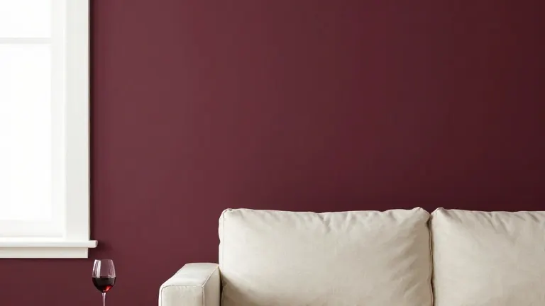
Many homeowners continue to use reds on feature walls to avoid overwhelming a space. This approach pairs well with classic off-white neutrals such as Resene Spanish White. The choice of a specific red shade depends on the natural light in the room. Southey advises that south-facing or cooler rooms suit warmer-toned reds, while naturally warm rooms can handle cooler-toned shades without feeling overheated.
Wine and berry reds are best suited for slower rooms like bedrooms, dining rooms, and sitting rooms. These colors can also be applied to doors, joinery, or furniture to add visual weight. For those ready to commit to a full color drench, Southey suggests using a muted shade like Resene Mulberry. This can be balanced with notes of Dutch White and a touch of spiced green Pacifica.
To prevent deep saturated reds from absorbing too much light in dim rooms, homeowners can use tints or limit the coverage. Using half or quarter tints of a shade like Merlot keeps the wine red character while reflecting more light. Alternatively, saving the full strength color for a contained area like a cabinet or single wall prevents the entire space from feeling dark. For a guest toilet, Southey suggests pairing walls painted in Resene Cab Sav with a mirror and glass light fitting to bounce light around.
The finish of the paint also changes how the color appears. A velvety low sheen or flat finish gives these deep hues a suede-like quality. Higher gloss levels intensify the color and reflect more light. Southey points to an emerging trend of pairing rich reds with dusty blues and muted greens. This combination softens the formality of deep reds while keeping the look current.
Specific pairings suggested by Southey include Resene Aroha with Duck Egg Blue, or Resene Staccato with Sea Fog. She describes Aroha as a statement burgundy and Hukanui as a softer, muddier burgundy that is very current. Upstage is noted as a deep luxurious plum that feels inviting rather than gothic, while Toledo offers an earthy plum-brown for a cosy interior.
Source: The Star